Gen-Find Research Associates
| Heraldry of the World |
| Canada heraldry portal Civic heraldry of Canada Armorial Canadienne |
|
GEN-FIND RESEARCH ASSOCIATES
Official blazon
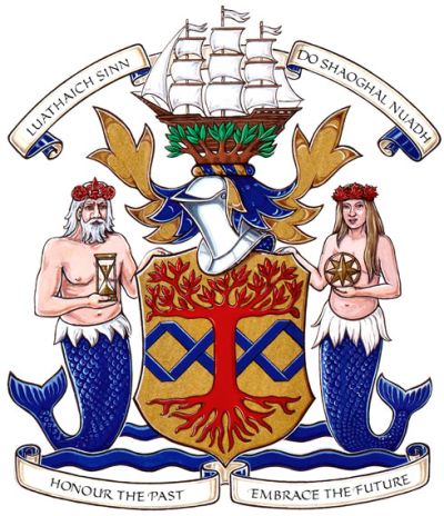
Arms : Or a spiral of two bars Azure, overall an arbutus tree eradicated Gules
Crest : Issuant from arbutus branches a ship of three masts proper
Supporters : Dexter a merman proper queued Azure, his beard and hair Argent, wearing a wreath of fleurs-de-lis and roses Gules and holding an hour glass Or, sinister a mermaid proper queued Azure wearing a wreath of maple leaves Gules and holding a compass rose Or, both issuant from barry wavy Azure and Argent
Mottoes : LUATHAICH SINN DO SHAOGHAL NUADH and HONOUR THE PAST • EMBRACE THE FUTURE
Origin/meaning
The arms were officially granted on September 15, 2010.
Yellow, blue, and red are the corporate colours of Gen-Find Research Associates, Inc. The blue spiral evokes a Watson-Crick Double Helix – the basic structure of DNA – and therefore symbolizes bloodlines as a chain linking generations. In its colour and position, the spiral also alludes to the personal coat of arms of the company’s founder, Brian W. Hutchison, which features a blue fess charged with three bezants. The arbutus tree represents genealogical research, the company’s principal service, and is indigenous to Vancouver Island, where Gen-Find’s corporate headquarters are located. With its roots below the blue spiral and its branches above it, it also signifies the persistence of family ties across space and time.
The ship represents the experience of migration that typifies the family history of most Canadians. In the mythology of the Coast Salish people of Vancouver Island, survivors of a great flood moored their canoes to the upper branches of the arbutus. The positioning of a European-style ship in the leaves of the tree thus symbolically fuses Old- and New-World traditions.
Mermaids and mermen represent the idea of seaborne migration and new beginnings, already suggested by the crest. The white-haired and bearded merman, with his crown of roses and fleurs-de-lis, represents the Old World, while the youthful mermaid, with her crown of maple leaves, represents the New. The hour glass and compass-rose signify time and space respectively.
The Gaelic sentence LUATHAICH SINN DO SHAOGHAL NUADH, meaning “We hastened to a new world,” emphasizes the importance of migration to the company’s work.
The other motto is an invitation to the celebration of past, present and future history.
Contact and Support
Partners:
Your logo here ?
Contact us
© since 1995, Heraldry of the World, Ralf Hartemink 
Index of the site
Literature : Image and information from http://www.gg.ca


