Coopérative des paramédics de l'Outaouais: Difference between revisions
Knorrepoes (talk | contribs) (Created page with "{{ca}} ''' {{uc:{{PAGENAME}}}} ''' [[File:{{PAGENAME}}.jpg|center|300 px|Arms of {{PAGENAME}}]] ===Official blazon=== '''Arms''' : Gules semé of fir trees Or, on a pile wa...") |
(No difference)
|
Revision as of 11:17, 28 December 2018
| Heraldry of the World |
| Canada heraldry portal Civic heraldry of Canada Armorial Canadienne |
|
COOPÉRATIVE DES PARAMÉDICS DE L'OUTAOUAIS
Official blazon
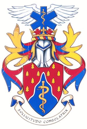
Arms : Gules semé of fir trees Or, on a pile wavy reversed Azure fimbriated Argent a rod of Aesculapius Or
Crest : Issuant from a circle of fleurs-de-lis Or and maple leaves Gules a star of life Azure, its rod of Aesculapius Or, in front of a vol Argent
Motto : SOLLICITUDO CONSOLATRIX
Origin/meaning
The arms were officially granted on June 15, 2016.
Burgundy is the historical colour of the Coopérative des paramédics de l’Outaouais, while the yellow is reminiscent of the orange colour of ambulances in the province of Quebec. The rod of Aesculapius is a traditional symbol of medicine and emergency services. The colour blue and the wavy triangle shape allude to the two rivers that border the Outaouais region, the Gatineau River and the Ottawa River. Fir trees evoke the natural environment in which the cooperative works.
The star of life represents emergency medical services. The wings, positioned at the top of the arms, represent the fact that paramedics are often seen as guardian angels for their patients. The elements of the crown refer to the location of the Coopérative des paramédics de l’Outaouais, in both Quebec and Canada.
The motto means “A reassuring presence”.
Contact and Support
Partners:
Your logo here ?
Contact us
© since 1995, Heraldry of the World, Ralf Hartemink 
Index of the site
Literature : Image and information from http://www.gg.ca


