Greater Vancouver Transportation Authority Police Service: Difference between revisions
Knorrepoes (talk | contribs) m (Text replacement - "''' :" to "''':") |
Knorrepoes (talk | contribs) m (Text replacement - "{{ca}}'''" to "'''") |
||
| Line 1: | Line 1: | ||
''' {{uc:{{PAGENAME}}}} ''' | |||
[[File:{{PAGENAME}}.jpg|center|450 px|Coat of arms (crest) of {{PAGENAME}}]] | [[File:{{PAGENAME}}.jpg|center|450 px|Coat of arms (crest) of {{PAGENAME}}]] | ||
Latest revision as of 10:56, 29 July 2024
GREATER VANCOUVER TRANSPORTATION AUTHORITY POLICE SERVICE
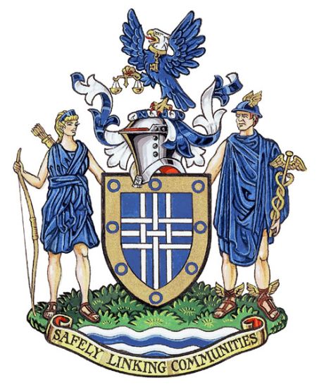
Official blazon
Arms: Azure a cross triparted and fretty Argent within a bordure Or semé of annulets Azure
Crest: An eagle rising wings elevated and displayed Azure, its head Argent, beaked and membered Or, gorged with a collar pendent therefrom a key and holding in the dexter claw a balance Or
Supporters: Dexter the goddess Diana proper habited Azure holding in her dexter hand a bow Or, sinister the god Mercury proper habited and wearing a cap Azure winged Or holding in his sinister hand a caduceus Or, both standing on a grassy mound Vert above barry wavy Argent and Azure
Motto: SAFELY LINKING COMMUNITIES
Origin/meaning
The arms were officially granted on January 20, 2005.
Blue and white are corporate colours of the Greater Vancouver Transportation Authority. The narrow interlaced bands represent the many routes, both land and water, guarded by the Service, and the gold border symbolizes the boundaries of the area in which it operates. The blue discs on the border symbolize wheels in motion, with the related idea that the Service is always on the move. They also refer to the many communities that are served and protected by the Service.
The eagle, a bird seen in many local communities, symbolizes speed and a swift response as important characteristics of the Service's work. The key is an indication of the role of the Service in providing security for the whole TransLink system, while the balance indicates the administration of justice.
The figures of Diana and Mercury symbolize swiftness of action and response, as well as the women and men of the Service and of the communities served. The grass and wavy bars refer to the land and water routes traversed by the TransLink system.
The motto is an expression of the Police Service's central mission.
Contact and Support
Partners:
Your logo here ?
Contact us
© since 1995, Heraldry of the World, Ralf Hartemink 
Index of the site
Literature : Image and information from http://www.gg.ca


