Jubilee Jewellers Inc.: Difference between revisions
Knorrepoes (talk | contribs) m (Text replacement - "'''Motto''' :" to "'''Motto''': ") |
Knorrepoes (talk | contribs) m (Text replacement - "|Arms of {{PAGENAME}}]]" to "|Coat of arms (crest) of {{PAGENAME}}]]") |
||
| Line 3: | Line 3: | ||
''' {{uc:{{PAGENAME}}}} ''' | ''' {{uc:{{PAGENAME}}}} ''' | ||
[[File:{{PAGENAME}}.jpg|center|450 px| | [[File:{{PAGENAME}}.jpg|center|450 px|Coat of arms (crest) of {{PAGENAME}}]] | ||
===Official blazon=== | ===Official blazon=== | ||
Revision as of 17:23, 20 August 2023
| Heraldry of the World |
| Canada heraldry portal Civic heraldry of Canada Armorial Canadienne |
|
JUBILEE JEWELLERS INC.
Official blazon
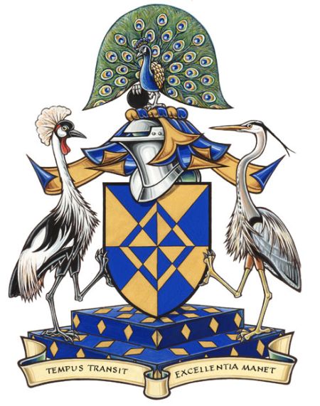
Arms : Gyronny Azure and Or a mascle counterchanged
Crest : A peacock in his pride proper its dexter claw resting on a pellet
Supporters : Dexter a grey crowned crane sinister a great blue heron proper standing on a jeweller’s display Azure semé of lozenges Or
Motto: TEMPUS TRANSIT • EXCELLENTIA MANET
Origin/meaning
The arms were officially granted on December 20, 2012.
Blue and gold are the corporate colours of Jubilee Fine Jewellers. The rays emanating from the centre imply jubilation, a reference to the company’s name. The division of the field suggests a cut diamond, one of the company’s products. It also includes gold and blue portions, a reference to the hours of the day and night and to another Jubilee product, timepieces. The blue triangular sections represent the waterways that converge at Ottawa, where the company is based. Their convergence emphasizes the centrality of the customer and of customer service to the company’s activities.
The peacock is a symbol of immortality and incorruptibility, alluding to the integrity and high standards of quality demonstrated by Jubilee Fine Jewellers. The black disc represents a touchstone, a black stone traditionally used for determining the purity of gold, reinforcing the ideas of excellence, honesty and incorruptibility.
The grey crowned crane is the national bird of Uganda, where the company was founded in 1952 and operated until 1972. The great blue heron, regularly observed in the Ottawa area, represents the company’s forty years serving the National Capital Region. The blue compartment set with gold lozenges suggests a velvet display case in a jeweller’s shop.
The motto means “Time passes, quality remains”.
Contact and Support
Partners:
Your logo here ?
Contact us
© since 1995, Heraldry of the World, Ralf Hartemink 
Index of the site
Literature : Image and information from http://www.gg.ca


