Koffie Hag albums-Variations: Difference between revisions
Knorrepoes (talk | contribs) (Created page with '{|width="100%" style="color:black; background-color:#ffffcc;" |width="15%"|50 px|left |width="70%" align="center" |<font size=x-large>'''Heraldry of the World<…') |
Knorrepoes (talk | contribs) No edit summary |
||
| Line 13: | Line 13: | ||
Unlike for example the German albums, which are rather similar in number of images, there are practically no true variations in the images in the Dutch albums. There are, however, many variations due to misprinting or separate printing editions. In addition to these, some images from the old series are reprinted in the style of the new series. Finally, there are many variations in the texts in the books. These are mainly due to the change from the old to the new albums. The new albums are generally printed on thinner paper as well. Due to the nature of the albums with loose sheets, copies of the albums nearly always contain sheets from both the first and the second printing. | Unlike for example the German albums, which are rather similar in number of images, there are practically no true variations in the images in the Dutch albums. There are, however, many variations due to misprinting or separate printing editions. In addition to these, some images from the old series are reprinted in the style of the new series. Finally, there are many variations in the texts in the books. These are mainly due to the change from the old to the new albums. The new albums are generally printed on thinner paper as well. Due to the nature of the albums with loose sheets, copies of the albums nearly always contain sheets from both the first and the second printing. | ||
During the time of issue of the albums, several mistakes were corrected and published at the end on 1928 ( see [[Koffie Hag albums-Errata en Voormalige Gemeenten| | During the time of issue of the albums, several mistakes were corrected and published at the end on 1928 ( see [[Koffie Hag albums-Errata en Voormalige Gemeenten|Errata]]), or in the new series of the 1930s. These are not considered variations. | ||
==Variations in images== | ==Variations in images== | ||
Revision as of 10:59, 23 November 2014
| Heraldry of the World Heraldic collector's items catalogue > Heraldic albums > Koffie Hag albums |
Variations and misprints
Variations and misprints in the stamps of the Dutch Coffee Hag albums.
Unlike for example the German albums, which are rather similar in number of images, there are practically no true variations in the images in the Dutch albums. There are, however, many variations due to misprinting or separate printing editions. In addition to these, some images from the old series are reprinted in the style of the new series. Finally, there are many variations in the texts in the books. These are mainly due to the change from the old to the new albums. The new albums are generally printed on thinner paper as well. Due to the nature of the albums with loose sheets, copies of the albums nearly always contain sheets from both the first and the second printing.
During the time of issue of the albums, several mistakes were corrected and published at the end on 1928 ( see Errata), or in the new series of the 1930s. These are not considered variations.
Variations in images
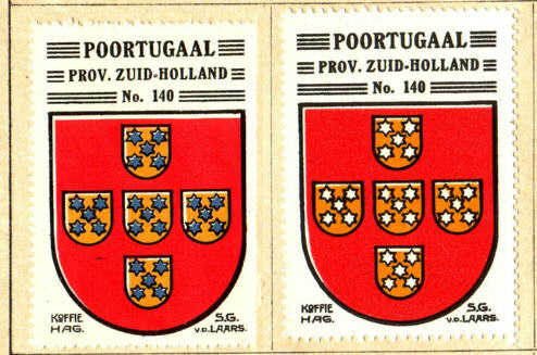
The only true variation in image is in the image of Poortugaal (Zuid Holland province number 140. The proper image shows the stars in blue, but variations in silver exist. Whether this is a mistake which is later corrected, or a misprint I don't know.
Variations in print
There are many different variations in the stamps due to misprinting and/or mis-perforating the stamps. This results in many variations in which the colours are slightly moved, in white spots on the stamps, or in arms that are not centred on the stamp. Mis-perforating also results in stamps of different sizes, such as too wide or too narrow.
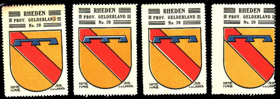
Misprinting, or shifting of the colours, regularly results in wrongly coloured elements of the arms, especially the small details. Below a few examples of misprinting in the stamps of the municipality of Rheden (shifting colurs and position).
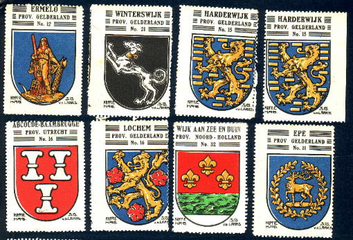
More examples of offcentere stamps are shown below.
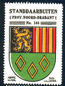
Another, probable, misprint occurs in the arms of Standdaarbuiten (Noord-Brabant number 146), in which in some prints the first part of the name is moved:
Sometimes even non-perforated images occur, which obviously have been cut by hand from the sheets. These generally are larger in size than the normal perforated stamps.
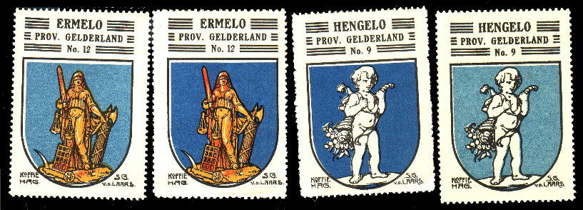
Finally there is a large variation in colour between different editions of the stamps. This is especially clear for the blue arms, but also clearly visible in other colours.
Variations in stamps between printings
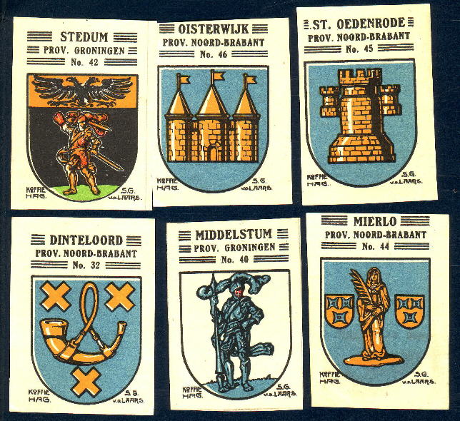
All the stamps of the first album (1920s series) show horizontal stripes around the name of the municipality, the province and the number. The stamps of the second album on the other hand do not have such stripes. Some of the stamps belonging to the first album (only municipal arms) were, however, reprinted in the style of the new albums. I have no idea how many stamps were reprinted. I have, so far, come across three different stamps: Sliedrecht, Rotterdam and (Den) Helder.
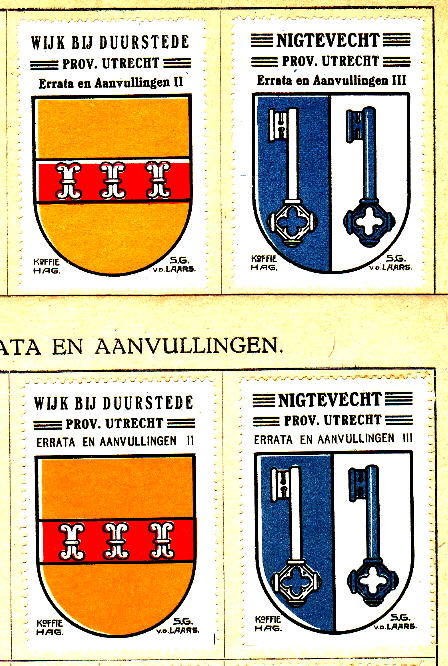
In another variation, the font of the texts on the stamps in the Errata section differs. Whether these are due to the first or the second edition, or simply two different printings, I do not know. The style of the stamp as such is like the first album.
Variations in album texts between printings
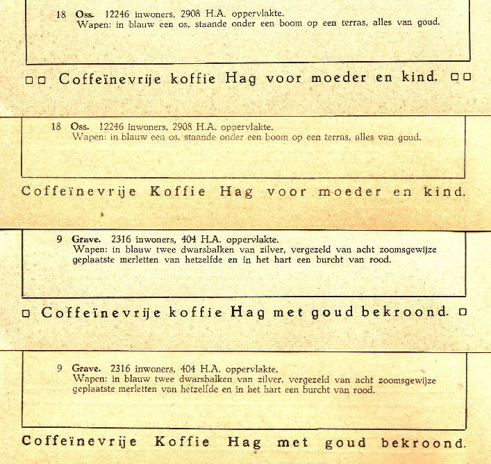
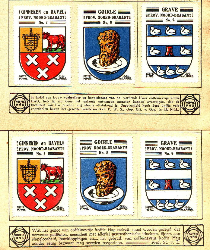
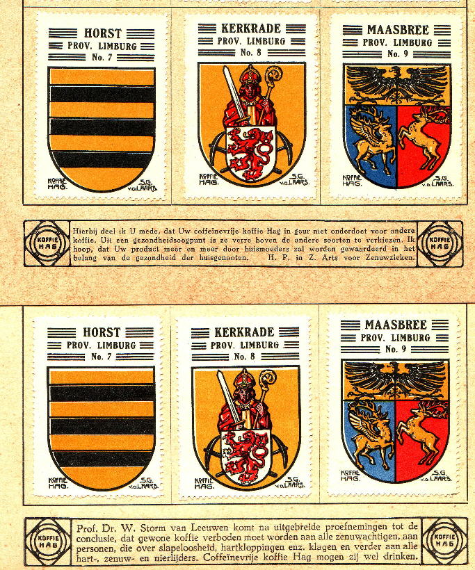
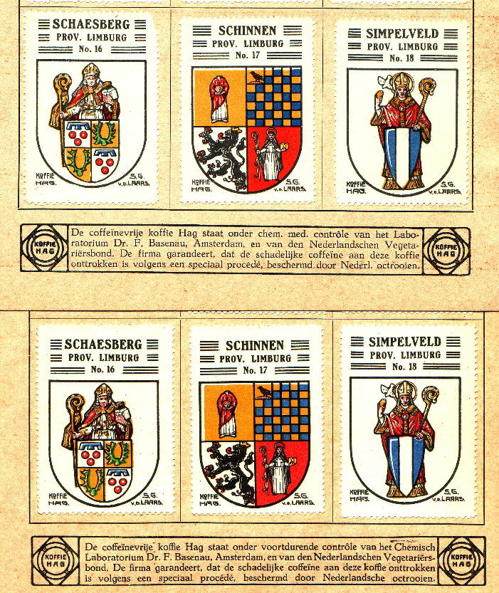
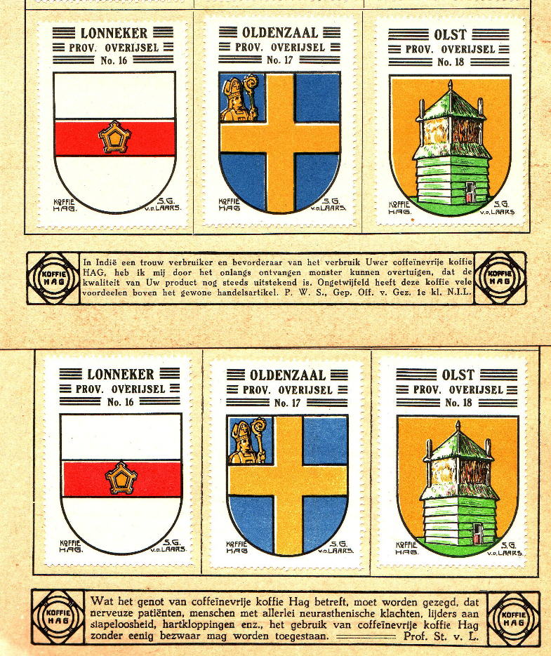
As far as I know there are no variations in the descriptions of the arms, or in any other main text in the albums. There are, however, several versions of the advertising/promoting quotes on the bottom of the pages between the different issues of the albums. There are differences in the printing itself, due to a slightly different font size, or totally different texts are used on the same album page. As far as I know variations only exist in the first album and are mostly likely due to different printers in the 1920s and 1930s series.
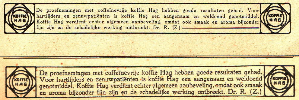
Same text, different fonts:
Differences between prints : 1920s without squares; 1930s with squares around the quote:
Different texts under the stamps on the same page:

